


scroll


The Annual Conference that goes beyond.
The Marketing Society have a yearly unique theme for their Annual Conference. In 2015, whilst working at MBA, I was tasked with creating the theme for both day and night events.
The conferences aimed to inspire guests to look beyond their typical working day, featuring a broad range of guest speakers from high-profile roles in the industry. The identity and marketing material for the event needed to compliment this thinking and inspire the guests with a memorable experience.
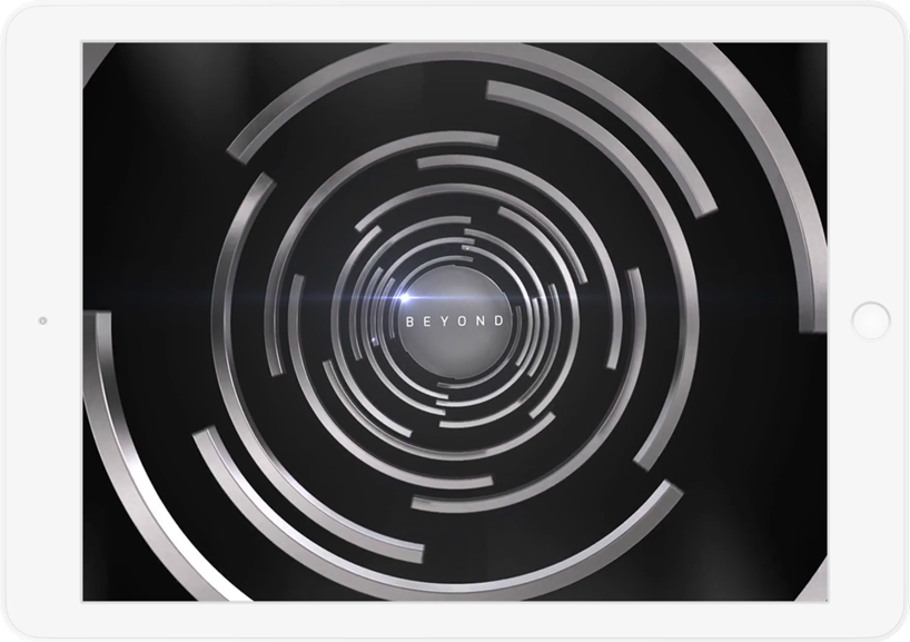
The versatile 'Wormhole' identity was created around the theme of 'Go Beyond', inspiring the designs to go beyond as well. For example, the microsite explored the boundaries of vector animation, the invitation used elastic bands to represent gravity and the event site had wormholes you can walk through.
The events both sold out, #GoBeyond created a buzz on social media and the venues were successfully transformed into portals to the future.

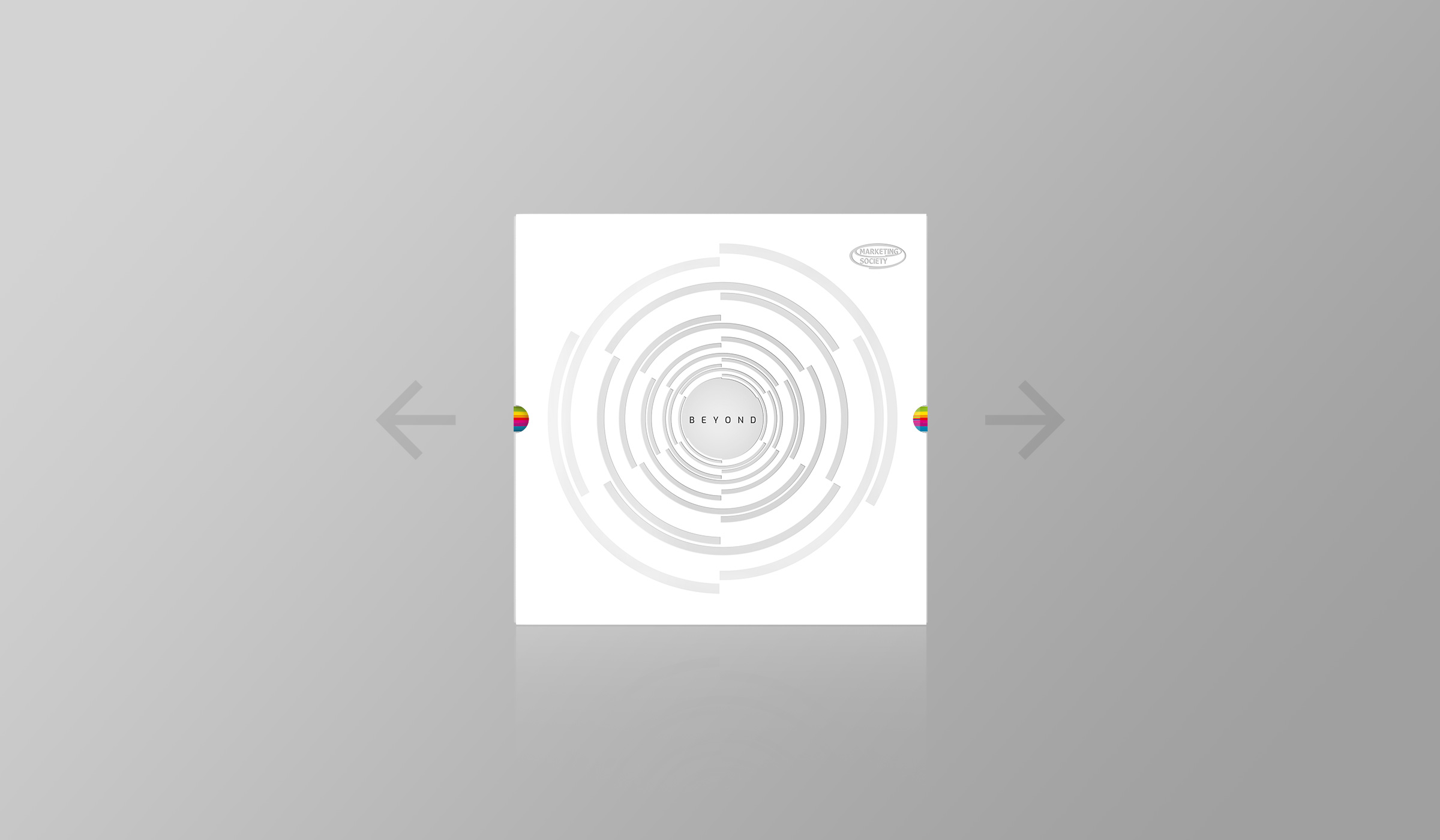
The open brief for the Marketing Societys Annual Conference was one word - 'Beyond'. After a weekend of work and careful thought, the idea of the wormhole was born, becoming the identity and catalyst for the rest of the events design.
Centered around the wormhole identity, the site morphed into day or night depending on which event you were attending and where you clicked. Working closely with developers, we decided to construct the design using animated SVGs to be interactive and work across devices.
Realising a lot of our audience may be using older phones, we made sure to create fallbacks for older devices and tested the site thoroughly.
The idea of pushing into the beyond was continued in everything we created. This custom print build was one of the many items I designed, featuring warping typography on elasticated acetate to mimic the pull of a black hole.
The events featured the wormhole identity throughout, from digital and print outputs to light projections and floor strips. The identity was striking and flexible in its use. Everything was designed and supplied on time and to the highest standard.
Next up:
Warm Penguins
